Give Yourself Over to CSS Grid – Mike Riethmuller
 We invited some of our Respond 17 speakers to contribute an article on a topic not necessarily directly related to their presentation theme, but that would fit in with the general themes of the conference.
Mike Riethmuller, who is presenting on Responsive, Progressive Fluid Typography at Respond, came up with this excellent piece about CSS Grid and its impact on our work.
Give Yourself Over to CSS Grid
By Mike Riethmuller
Whenever a new feature is added to browsers, I see developers trying to repeat familiar patterns. I’m not the first to say it, but I think very soon we’re about to see a lot of developers try to recreate familiar 12 column grid systems with native CSS Grid Layout. Which, by the way, has now landed in the current version of every major browser.
Grid is going to allow us to go way beyond what we can do with existing layout options. Unfortunately, before we get there we’re going to have to suffer a whole lot of conversations about why Flexbox is a better alternative, and Medium articles with titles like: “How I switched from Bootstrap’s grid to CSS Grid”.
We might all know CSS Grid is a unique tool with characteristics that provide for new possibilities, but we’re going to make these mistakes anyway. Some of us are even going to get scared and angry about it. You don’t need to look back very far to see how this might happen.
Although it’s more widely appreciated today, there were a lot of discussions early on about the merits of Flexbox. Many were quick to suggest that it had performance issues and if you Google “Is Flexbox slow?”, you can still see the remnants of these discussions.
With the exception of a few edge-cases and bugs, I don’t think Flexbox was ever slow. At least not in any meaningful way. Any minor bugs were quickly resolved, and browsers continue to optimise their algorithms in favour of modern features.
Once we realised it wasn’t slow, all we had left to complain about was its complexity. People said things like:
“I do wish it wasn’t quite so terrifyingly complex”
— John Allsopp, 2015.
But let’s be kind to John because he put it more mildly than most, and he was not alone in being terrified of Flexbox.
Flexbox introduced a wide range of new CSS properties and new terms to our vocabulary, including basis, shrink, grow, flex containers, flex items, align-items and justify-content. All of this at once was daunting and it was a new mindset too. Some of us had trust issues giving up control over the exact height or width of elements, but it turned out this was OK.
Grid is also about to introduce a whole lot of new terminology and new ideas such as lines, tracks, fr units, grid areas and grid cells. Luckily, it also builds on some concepts we’ve become familiar with through Flexbox. The idea of grid containers and grid items should make sense, as will the reason for properties like align-items and justify-content.
The hardest part will be letting go of ideas about how CSS Grid Layout should work. CSS Grid Layout is not the same as traditional CSS grid systems you might have used and you might be surprised at how much it differs.
For example, grid areas can easily span multiple columns and rows.
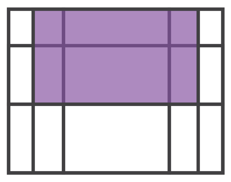
This can be done by defining the start and end positions of a grid item.
.grid-item {
    grid-column-start: 2;
    grid-column-end: 5;
    grid-row-start: 1;
    grid-row-end: 3;
}
CSS Grid layout also offers a number of other ways this could be achieved. One of the most interesting is the grid-template-area property. This enables us to use template strings to define grid areas on the container.
.grid-container {
    display: grid;
    grid-template-areas: "aside   main   main   aside"
    "aside   main   main   aside"
    "footer  footer  footer  footer";
}
On the grid item we can now assign a template area:
.grid-item {
    grid-area: main;
}
Neither of these examples is similar to traditional grid systems found in libraries like Bootstrap or Susy. To achieve spanning of columns and rows usually requires altering the mark-up, or using complicated positioning hacks.
When encountering something new like this it’s easy to get confused and then anxious, and to attribute that to complexity. They may seem complex when you’re try to solve the wrong problems, but when used for their own unique potential, Flexbox or Grid Layout are far simpler than alternatives.
I’m not saying that learning Grid Layout will be simple. In general, layout on the web is complicated, but once you’re past the initial learning curve, I think you’ll find that, like Flexbox, CSS Grid is no more complex than the layout methods we cobbled together using floats, containers and clearfix hacks.
Those methods we used for so long were not even meant for layout. It’s really exciting that now, for the first time in the 20 year history of CSS, we have options that are deliberately designed to help us solve complicated layout problems.
This should make things easier, but learning new stuff is hard. It takes time and can be frustrating. Not only that, when something doesn’t fit within the boundaries of our experience, it’s easy to be disappointed, confused and fall back to solving the same old problems.
This process isn’t new or surprising. If you watch some of the first TV news broadcasts it’s easy to see the influence of radio in the slow, clear pronunciation of words, or the often redundantly detailed descriptions of locations. This pattern has repeated with the influence of live theatre in early film, and film in animation. In each case, it has taken time and experimentation to fully discover the unique potential of the new media.
This holds true for the web as well. It’s easy to see influence of print design embedded not only in our typography and visual design practices but also in the technical architecture and meta language of the web.
This is something we do on small scales as well as large. It’s common to carry over perceived limitations from our past experience by falsely assuming that new technologies will work in a similar way, will solve similar problems and will have similar constraints to those we currently experience.
I’ve seen this happen with the slow uptake of viewport units, people’s initial attitudes towards calc() and in treating SVG like any standard image format. I’m hopeful that with these experiences we won’t do the same again with Grid Layout.
Grid, or any new feature, probably won’t solve your current problems better – it’s the answer to problems you haven’t found yet.
I’m not yet sure what unique potential CSS Grid might offer us, but I can’t wait to find out.
Great reading, every weekend.
We round up the best writing about the web and send it your way each Friday.