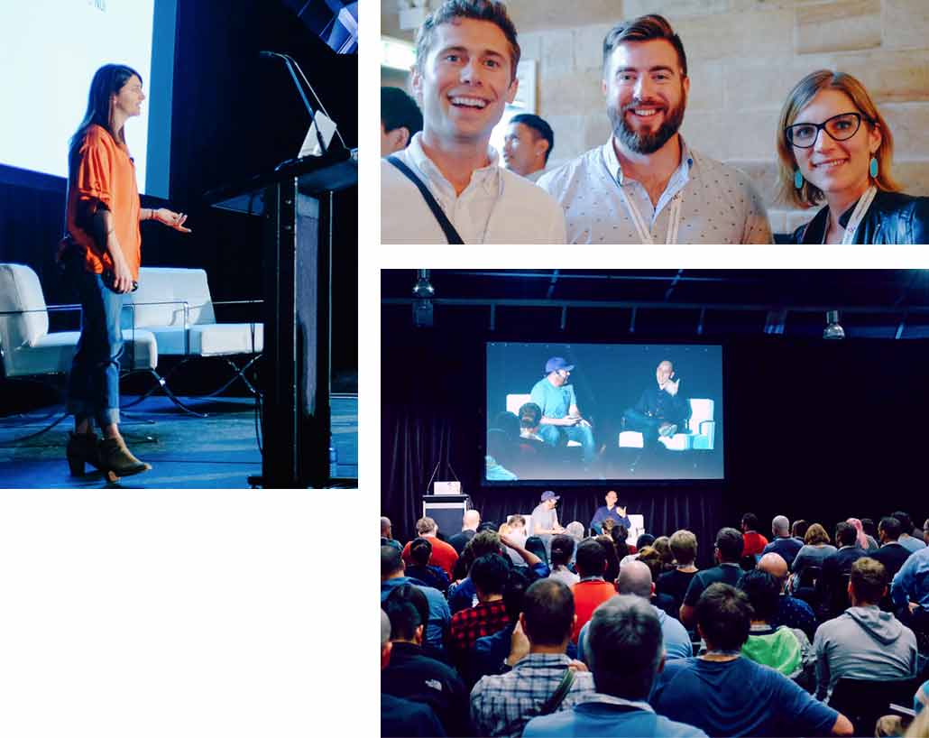
Why Respond?
The technologies, devices, practices and techniques for delivering compelling Web based experiences are ever changing. Last year's bleeding edge is this years status quo. We've lived and breathed the Web for more than 20 years, and use this unique perspective, and deep knowledge to curate two days of in-depth, invaluable presentations from local and world leading experts. Past speakers have included Ethan Marcotte (inventor of 'Responsive Design'), Scott Jehl, Karen McGrane and Sara Soueidan. This year's speakers come from leading companies and organisations like Dropbox, Microsoft, Hillary for America, Westpac and Shopify.
Who's it for?
Respond is designed for the whole front end team: Web designers, UI engineers, Interaction and User Experience experts, content strategists, product designers and managers, digital producers, creative and art directors–everyone involved in delivering customer experiences.
Real World Knowledge
Now in its fourth year, and curated by John Allsopp, cited by Ethan Marcotte as one of the inspirations for Responsive design, Respond goes beyond the technology, to address the myriad challenges we face in delivering modern, responsive experiences.
- 300+ Passionate attendees
- 20 Transformational speakers
- 2 Cities
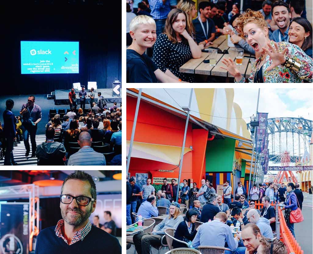
Praise for past Web Directions events

Web Directions is the must-attend event of the year for anyone serious about web development.
Phil Whitehouse,
Innovation Lead DigitasLBi

I’ve been admiring the Web Directions events for years, and was honored to be part… What a fantastic event!
Ethan Marcotte,
inventor "responsive Web design"

Out of any conference, Web Directions is far and away our favourite
Dave Greiner,
founder Campaign Monitor
Big Ideas
Start and end each day with inspiring talks from our industry's leading minds, including:

Styling Hilary: A Design System for all Americans
Mina Markham Senior UI Engineer
In this talk, Mina will share successes and failures from nearly two years at Hillary for America, including creating CSS architecture and implementing a redesign of the main website.
Read More

The Web In Motion
Rachel Nabors Animator, author
In this talk, Rachel Nabors looks at how animation helps people interact with touch screens, how those same principles apply to the web, and where animation has been all this time.
Read More

New Adventures in Responsive Web Design
Vitaly Friedman Founder
In this talk, Vitaly Friedman, editor-in-chief of Smashing Magazine, will be looking into a strategy for crafting fast, resilient and flexible responsive design systems by utilising all of those wonderful shiny web technologies we have available today.
Read More
Designing Conversational Commerce
Elizabeth Allen PhD UX Researcher
One type of tool that Shopify has developed for entrepreneurs is messaging bots that behave like “virtual employees” – they autonomously handle customer service interactions, online marketing campaigns, and even make sales.
These very simple bots help overwhelmed entrepreneurs stay on top of their businesses without spending the time and money required to hire additional human staff.
In this talk, Elizabeth discusses the UX research and design work that goes into developing these “game-changing” employees for busy entrepreneurs, and shares lessons learned along the way about facilitating communication between businesses and their customers.
Read More
Plus in-depth sessions like these
All our events feature industry leaders, and topics like these

The Great Accessibility Bake Off
Cordelia McGee-Tubb Accessibility Specialist
It’s always better to bake in accessibility from the very beginning of your project than tack it on after the fact. Making accessibility decisions up front in your web app can save your users a lot of frustration and save you a lot of development time. But how do you know what to bake in, how to mix it all together, and whether you’re doing it right?
In this talk we’ll look at the key ingredients of web accessibility — including semantic HTML, mindful color palettes, keyboard interactivity, and a dash of ARIA — and discuss some tried-and-true recipes for accessible web development. We’ll also knead through technically challenging accessibility feats like complex interactive widgets and drag-and-drop to achieve more inclusive interaction patterns. With these techniques in your back pocket, making an accessible website will be a piece of cake.
Read More
Design Systems + Dreams – delivering at scale
Rebecca Hendry Design Capability Principal - CX
Global experience languages, design systems, or whatever you choose to call them are without doubt a hot topic in experience design and front end. For individuals and smaller teams focused on a few large projects or products; design systems not only make a lot of sense, but they’ve been shown to deliver real benefit to the business and cohesive delight to the end user. But what happens at ‘industrial’ scale? When delivering huge numbers of products and services, via multiple platforms, for multiple brands, used by dispersed teams, many of whom aren’t really able to spend their design time contributing to the system for the greater good?
Let's find out.
This year, Westpac celebrates its 200th year in business. More than just the iconic Westpac brand, the Group represents St George, Bank of Melbourne, Bank SA, Rams and BT Financial Group - all strongly differentiated in the market. When multibrand became a reality, it decided to tackle the creation of its own GEL or Global Experience Language. The passionate intent is that GEL becomes the single source of truth to create world leading experiences for all customers, everywhere, every time.
In this session, Rebecca Hendry, Design Quality Principal for Westpac Digital’s Experience Design & Delivery team, looks in depth at the design system; how it was created, how it evolved, how they pitched it, its value, and most importantly, what they’ve learned. There'll be valuable lessons for those who already love working with design systems, and for those who want to - no matter the scale.
Read More

Building a ubiquitous design language with components
Michael Taranto Principal UI Engineer
UI developers and visual designers, despite working very closely, often speak very different languages without realising it. Most discussions use terms that simply do not align across domains. Whether it is CSS's misuse of terms like line-height and baseline or HTML5's semantics not aligning, these deviations result in confusion and less maintainable code.
The world of components give us the opportunity to create abstractions that directly model the designer team's intent. The drive to establish a ubiquitous design language has improved the quality of conversation and the consistency of the dev team's output — innovating on solutions to things like vertical rhythm on the web. If you care about building large scale well-designed apps quickly while still focusing on maintainability, accessibility and composition, this one is for you.
Read More

The Anatomy of an Accessible Auto-suggest
Adem Cifcioglu Director of Accessible Technologies
Google first launched auto-suggest (aka Google Suggest) as a Google Labs project in 2004 saying it "... provides you with search suggestions, in real time, while you type".
Since then, it's become commonplace on the web and is used pretty much everywhere from social media sites like Twitter and Facebook, to shopping sites like eBay and Amazon, and even in occupation validation for credit card applications.
With auto-suggest plugins available for all the latest frameworks and libraries, implementation couldn't be simpler.
But what about accessibility?
This talk will look at what makes an accessible auto-suggest. You'll see examples that don’t work, and examples that do.
You'll go through:
- Required ARIA roles, states and properties
- Keyboard access
- Marking up the input field
- Announcing the suggestions
- Navigating to the suggestions list
- Making a selection
- Closing the suggestions list
You'll leave with an understanding of how to make auto-suggest accessible - and some code to help you do it.
Read More

Responsive, progressive fluid typography
Mike Riethmuller Web Developer
Type that responds to the user's screen size, orientation and resolution is a holy grail of responsive design.
In this presentation, Mike Riethmuller will provide a general overview of unit types and values in CSS, with a specific focus on how viewport units and calc() expressions work. Armed with this understanding, we're going to learn how to create a function with CSS that uses viewport units as a variable. Milke will then demonstrate some practical uses for this technique including:
- min and max font sizes,
- fluid typography,
- fluid modular scale headings, and more
Finally, let's discuss the future of fluid design and through variable typography our relationship with media queries.
And we'll see how each of the typography techniques can be used today and applied with progressive enhancement!
Read More

Sharpen up your text with The Power of Three
Mandy Michael Lead Front End Developer
In a world where JS and SVG are taking over, it’s easy to forget the power of CSS. Luckily there are three powerful CSS items, each with a specific use, whose strengths are enhanced when used together. Their destiny is to give you the freedom to let your creativity shine.
Clip path, data-attributes, and pseudo-elements provide us the opportunity to get creative with standard web text. No tricks here, just straight up CSS and HTML!
We’ll explore some ways in which we can use clip path, data-attributes, and pseudo-elements to create more beautiful websites. Focused around interesting text effects, you’ll also see some creative layouts and animations. There is a lot you can accomplish with a little creativity, and the Power of Three.
Read More
Creative (yet still useful) SVG animation
Brett Snaidero Interactive Designer
Animated effects for the web add a world of difference and delight. Using CSS properties to style SVG makes it fun, simple and easy to engage your audience. So come and join Brett as he lifts the lid on some fantastic web conjuring tricks with SVG. He will show how CSS can be used to style and animate SVG, giving designers an easy way to introduce animation into their websites.
Join in the fun as Brett demonstrates how simple CSS animations can be applied to add style and substance to a page, without having to deal with complicated Javascript animation libraries. Nurture your creative spirit and learn new ways to play your way to design heaven on the web.
Read More

Designing OneABC, a typeface for Australia
Wayne Thompson Type Designer
How do you design your country’s national font? Wayne was asked to do this by the ABC, Australia’s most trusted media brand. They set out to create a font family that unifies the ABC's digital presence across multiple platforms, while also being best-in-class for legibility and accessibility.
It’s designed to replace the thousands of font configurations in use across the ABC, allow for a proud, uniquely Australian typographical expression, and align with their charter to deliver content that contributes to our national identity. Wayne’s here to tell you about the project which consumed him for over a year.
Read More

Designing for Growth
Mike Sharp Senior Frontend Engineer
First up, this talk will introduce you to the (Mike's) “Five Fs” of design. We’ll then dive a little deeper into the fourth F - Designing with Facts. A huge benefit of modern web applications is the wealth of data they can provide to designers.
We’ll look at what sort of information is available and how using it can help shape the products we build.
Graph paper is optional
Read More

Think aloud user testing - challenging established status quo
Shefik Bey Co-founder
At Loop11, our team has been discussing the potential influence and impact of the think aloud method of user testing on the natural usage behaviour of participants. Does the method distract or change the way in which users naturally interact? Are we introducing bias into the testing process by making respondents verbalise their inner monologue?
There have been previous research studies that do cite an impact on behaviour, however with the growth of rapid online testing and the availability of quantitative metrics, the relative merits and drawbacks of employing this approach have become even more pertinent.
Our team formed its own hypothesis, that the think aloud method would extend task completion times and influence the depth to which participants explore navigation and content. We were also concerned that the approach would lead to a skew towards more vocal (possibly extroverted) attitudinal behavioural types and under-representation of others.
To put the approach to the test, our team designed a comparative testing scenario to pit think aloud testing against testing carried out without the need to verbalise thoughts.
When running the same set of tasks and questions, on the same website, but using two different usability testing tools, one prioritising think aloud, we recorded significant difference in the testing results - though not exactly in ways we had expected!
Surprisingly, for the most part we found no real discernible difference in time on task. However, an interesting result from the three studies was that the greater the level of anonymity, the lower the NPS but the higher the SUS. Does this mean that if a user knows they are being recorded, and their responses will be rated, then they are more likely to award a higher NPS score? Within this limited sample, it would appear so.
How test participants are sourced also impacts results. Providing incentives for performing tasks in a certain manner (very articulate and deliberate) leads to further skewing of results. Rating of participants perpetuates this phenomenon. Participants should be incentivised for completing the study in a natural manner, not what pleases the viewing experience.
Read More

The (ancient) art of conversation: Styling beyond the GUI
Laura Summer UX Engineer
What happens when your ability to persuade *is* your UI?
Looking to antiquity to reframe our vision of the future, this talk uses the 5 Canons of Rhetoric from ancient Greek philosophy as a framework to examine how we will design and build chatbots, hybrid UIs, and hidden UI interactions going forwards.
Invention, Style, Arrangement, Delivery and Memory: these canons were conceived to win hearts, minds, and votes. In digital, our measures of success are engagement, traction and conversion - and when our computing interactions are reduced to simple conversations, our entire arsenal may once again be rhetoric. Let's learn what philosophy can teach us about designing for the future of computing.
Read More

Removing everything and having a crap UI
Warwick Cox Founder and CEO
When Crowd Delivery, an on demand delivery company, was first launched, it tried to make its interface like every other online shop. But then to test an idea, it basically removed everything.
Within one week Crowd Delivery started to get heaps of traction and has done so ever since.
The secret sauce? Enabling converations between a buyer and the person doing their shopping for them.
Read More
Masterclass
Smart Responsive UX Design Patterns
Sydney: May 3rd, Melbourne: May 10th, Brisbane: May 11th
with Vitaly Friedman
In this workshop, Vitaly Friedman (editor-in-chief of Smashing Magazine), will cover practical UX techniques, clever tricks and useful strategies you need to be aware of when designing responsive websites. From complex responsive modules to clever navigation patterns, tables, accordions, calendars, dashboards and form design techniques; the workshop will provide you with everything you need to know today to start designing better responsive experiences tomorrow.
This workshop will cover:
- Effective tools and techniques that can support and enhance your personal workflow when working on any responsive design project,
- How to build and maintain future-proof pattern libraries and design systems,
- An overview of clever practical techniques for improving UX of responsive sites incl. navigation and search,
- Responsive Design Patterns and innovative approaches to designing "responsive modules" such as mega-drop downs, tables, calendars, multi-level menus, maps, carousels and web forms,
- How to apply clever patterns such as improved off-canvas navigation, assistant pattern, smart URL design, priority+ pattern, vertical media queries, “view mode” approach, lazy loading, autocomplete, type-ahead search, filters, portrait/landscape orientation change, inventory-based sliders, the country selector and responsive iconography,
- How to craft delightful interfaces with smooth transitions, clever animations and improve perceived performance along the way,
- How to optimize responsive websites for better mobile UX, faster data input and higher conversion rates,
- Design anti-patterns to avoid when designing a responsive site to not run into performance issues and “slow UX decay”, and
- How the design processes should adapt in terms of the project management, deliverables, performance budgets, team organisation and strategy.
$599 workshop only standard pricing
What we covered in 2016
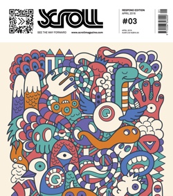
Go even deeper with the Respond edition of Scroll, our beautiful, event–themed magazine.
Profiles, interviews, articles and more.
Watch key presentations from Respond 2016

SVG + CSS: A Designer's delight
Sara Soueidan SVG Guru
You've probably been using CSS since you began your journey in Web design, and perhaps now you use SVG a little, or a lot. But together they add up to much more than the sum of the parts.
Read More

Laziness in the Time of Responsive Design
Ethan Marcotte Mr. Responsive Design

Real Art Direction on the Web
Jen Simmons W3C Invited Expert, Mozilla
Stay in the loop
Keep up to date with Respond and all our conferences, and get access to The Wrap, our wrap up of every session from Respond 2016 conference, and Scroll, our stylish magazine. Or register now for the best price.
Sydney & Melbourne |
Gold Pass
|
Silver Pass
|
Classic Pass
|
Conference
|

|

|

|
Speaker DinnerJoin our speakers at a nearby restaurant for a relaxing meal, and engaging company. |
|
||
VideosRespond 2017 Conference videos |
|
|
|
Upgrades |
|||
|
Add the workshop for just $499 | Add the workshop for just $499 | Add the workshop for just $499 |
|
|
|
|
Sydney & Melbourne
(2 Day conference)
Gold Pass
Conference
Speaker Dinner
Videos
- $1,499 Standard
Register Sydney Register Melbourne
Silver Pass
Conference
Videos
- $1,299 Standard
Register Sydney Register Melbourne
Classic Pass
Conference
- $1,199 Standard
Learn together
Teams get more
Send a team of 3 or more to Respond 16 and save $100 per team member off the prevailing price.
Just register 3 or more people and you'll automatically get the discount for the conference, workshop or conference/workshop combination.
Special Pricing
To make Respond as accessible as possible we're offering even better pricing for a number of different types of attendee who may not have the biggest training budgets, but hurry, these are limited (and please be cool, this is not just to help your boss get more bang for their corporate training buck!).
Not for profit employees register for just $699, saving up to $500, using the code NFP when you register.
Independent professionals also register for just $699, saving up to $500, using the code freelance when you register
Season Tickets
Introducing something brand new for 2017. Web Directions holds a number of conferences each year, including Code for Front end engineers, Respond for front end designers and Direction for Web, product, interaction and experience design leaders. Choose a "season ticket" of two or more conferences to get fantastic pricing. But these prices are so good that they are for individuals only, and these tickets aren't transferable. But if you're keen to send members of your team to multiple of our events, drop us a line, and we'll put together a package based on your needs.
Sydney and Melbourne
If you're in Sydney or Melbourne, attend:
- Two of our conferences (Code, Respond and Direction) and get a silver ticket to each for just $1,999
- All Three of our major conferences–Code, Respond and Direction– and get silver tickets to each for just $2,499
How do I get my season ticket?
Keen to reserve your season ticket? Just drop us a line at [email protected], and we'll set it all up.
Melbourne
Respond 2017 will be held in the ANZ Pavilion at the iconic Arts Centre Melbourne, right on the Yarra in Southbank.
- ANZ Pavilion,
- Arts Centre Melbourne,
- 100 St Kilda Road, Melbourne
Getting there:
With excellent public transport connections right outside, and Flinders Street Station right across the bridge, it's our best connected location yet.
Accommodation:
The Southbank area has many accomodation options, from the luxe (where we put our speakers) to the budget conscious (where we stay!)
Sydney
Respond 2017 Sydney will be held at the National Maritime Museum, in Darling Harbour.
- Maritime Museum,
- 2 Murray St,
- Sydney, NSW
Getting there:
The Museum is a very pleasant 10 minute walk from Town Hall Station, or right across the road from the Pyrmont Bay Light Rail stop. Darling Harbour is also serviced by many ferries and buses.
Accommodation:
Darling Harbour and surrounds has many accomodation options, from budget to 5 star.
Partners
At Web Directions we work closely with partners to help make our events even better. Sponsor our coffee, reception, recharge station, or other valued activities and start or grow your relationship with our highly qualified audience.
Contact us for more on how we work can work with you to help you be even more awesome.


The price of anything is the amount of life you exchange for it
Henry David Thoreau
We know you are busy
Creating and managing a great team, exploring the creative limits of today's technology, and tomorrow's. We know your life is full to the brim with meetings you can't miss.
What we'll deliver is ROT (return on your time). We'll help you save time avoiding rabbit holes of hype that doesn't match reality. We'll help you invest your time wisely in the technologies, ideas and projects that will deliver for your company, clients and partners.
About Us
Co-founded and now run by John Allsopp, Web Directions has for over a decade brought together leading developers, engineers, visual, IxD, UX and product designers, Art and Creative Directors, indeed everyone involved in producing web and digital products to learn from one another, and the World's leading experts across this vast field.
We spend our lives thinking about what comes next, keeping up with trends in technology, practices and processes, and filtering the hype, to make sure you don't miss trends that matter, and don't waste time on hype that doesn't.
We promise attending one of our events will leave you significantly better versed in the challenges you face day to day, and in solutions for addressing them.
In 2017, we'll be organising Respond in Sydney and Melbourne, Transform in Canberra, Code in Sydney and Melbourne, and Direction in Sydney.
John Allsopp
John Allsopp has been working on the Web for over 20 years. He's been responsible for innovative developer tools such as Style Master, X-Ray and many more. He's spoken at numerous conferences around the World and delivered dozens of workshops in that time as well.
His writing includes two books, including Developing With Web Standards and countless articles and tutorials in print and online publications.
His "A Dao of Web Design" published in 2000 is cited by Ethan Marcotte as a key influence in the development of Responsive Web Design, who's rightly acclaimed article in 2010 begins by quoting John in detail, and by Jeremy Keith as "a manifesto for anyone working on the Web".
Code of Conduct
For over a decade, we've worked hard to create inclusive, fun, inspring and safe events for the Web Industry.
As part of our commitment to these values, we've adopted a code of conduct for all involved: ourselves, our speakers, our partners and our audience.
If you have any concern or feedback, please don't hesitate to contact us.