CSS3 Radial Gradients
Getting your head around CSS3 radial gradients
We recently took a detailed look at linear gradients in CSS3. If you’ve not read that, you might like to spend a few minutes doing so, as the concepts are very similar, and I don’t spend quite as much time in this article on the fundamentals of gradients which I’ve already covered there.
This time we’ll look in detail at radial gradients. If you’ve got a good sense of how linear gradients work, radial gradients should present no great difficulty. And, I’ll again introduce an updated tool for creating radial gradients, which supports the current syntax, and works across all modern browsers which support radial gradients (more on which they are shortly).
A brief history
Like linear gradients, radial gradients were first introduced in Webkit in 2008. Like linear gradients, they are still in a draft CSS3 specification, and indeed are still in something of a state of flux, so it is more than possible the final specified version will be different from that described here. As with linear gradients, radial gradients as originally proposed by Apple’s Webkit team had a different syntax, and quite significantly different conceptual basis from how they are currently specified, and from how they are supported in current browsers. With Safari 5.1, all modern browsers have harmonized on the same syntax, and conceptual basis for radial gradients, which is what we cover here. Safari 4, and Chrome 10 and up support a very different syntax, and model for radial gradients, which is effectively obsolete, and which we won’t cover here.
What exactly is a radial gradient?
I’ve thought long and hard about whether to try and explain what is really going on with a radial gradient (and for most folks, simply playing around with them is likely the best way to really come to grips with them). But, as I’ve yet to see a very good description of exactly how radial gradients work, here’s my attempt.
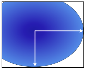
You’ll hopefully remember that linear gradients have a straight gradient line, from one edge of the element’s background box. It could be vertically from top to bottom, or bottom to top. It could be horizontally from left to right, or right to left. Or it could be at an angle, from left to right, right to left, upwards or downwards.
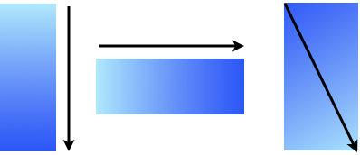
Some common linear gradient lines
We then specify two (or more) colors to create the gradient along this line. The gradient “smoothly fades” from one color to the next along the gradient line. So, what exactly does “smoothly fades” mean? To get all technical on you, the Image Values and Replaced Content module of CSS3 says “between two color-stops, the line’s color is linearly interpolated between the colors of the two color-stops, with the interpolation taking place in premultiplied RGBA space”. Glad you asked? And if you really want to get down and dirty with linear interpolation, the spec has a whole section on it.
Radial gradients also specify a gradient line, but this time, the line goes from the center of an ellipse, outwards in each direction to the edge of the ellipse. Along this line color also “fades smoothly” from one color stop to the next.
We also know from linear gradients, that the gradient can have intermediate stops between the starting and final color. Not surprisingly, radial gradients can have color stops, specified as being a certain percentage, or length value, along the gradient, between the start and final colors.
But where radial gradients differ significantly from linear ones, is the shape and size of the gradient, as well as a gradient’s location.
In essence, to specify a radial gradient, we give the gradient
- a location
- a shape
- a size
- one or more color stops
Let’s look at each of these, though slightly out of order, because to understand how they all work, we need to understand a little bit about what an ellipse is (this won’t hurt a bit I promise).
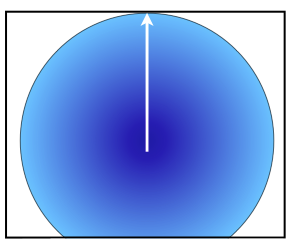
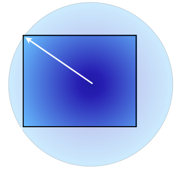
Ellipses
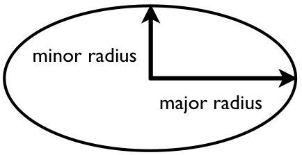
An Ellipse, showing the major and minor radii.
An ellipse is what we more colloquially call an oval. It differs from a circle in that its width and height are different from one another (strictly speaking, a circle is a kind of ellipse where the width and height are equal).
As you can see here, a circle is a special kind of ellipse where these two lines are the same length.
If you drop a vertical line through an ellipse at its tallest point, and a horizontal line through it at its widest, where these two intersect is the center of the ellipse. The longer of these two lines is called the major semi-axis or major radius, and the shorter the minor semi-axis or minor radius.
From all this, the key concepts to take away are
- What the center of an ellipse is
- What the radii of an ellipse are
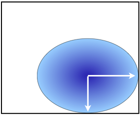
Radial gradient location
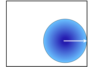
We give a radial gradient a location by specifying where its center will be in relation to the element it is a background image for (we’ll leave aside the case where the gradient is used elsewhere for now).
We can specify the location of the ellipse’s center essentially the same way we specify the location of a background image with the background-position CSS property. We specify the horizontal position of the background, and optionally the vertical position using either keywords (left, center right, or top, center, bottom), length values, percentage values, or some combination of these. For example we might have
- left bottom
- left 100%
- 0% bottom
- 0% 100%
Which all specify that the center of the gradient ellipse should be in the left bottom corner of the element background.
Where the second value is omitted, it is treated as center (similarly, if we omit the first value as well, the center of the gradient ellipse is in the center of the element’s background.)
So, let’s start putting together a radial gradient. As we saw with linear gradients, a gradient is not a CSS property. Rather it is a value, that can in theory be used anywhere an image would be used, but in practice, typically only as a background image on an element. Here we’ll start a radial gradient as the background image of an element, and give it a location. We’ll place the gradient in the center of the element’s background.
background-image: radial-gradient(50% 50%,
Notice how the horizontal and vertical center values are simply separated by a space, and then pair is then followed by a comma. Note too that this is not yet a gradient, just the start of one. We still need to specify the shape and size, plus its color values.
Radial Gradient shapes and sizes
Now we’ve specified the location of the center of the gradient, we need to specify the shape and size of the ellipse. These can be specified in one of two ways, implicitly, or explicitly.
Explicit shapes and sizes
We explicitly specify the shape and size of the ellipse for our radial gradient by specifying the lengths of the major and minor radius, using a length or percentage value. (as of July 2011, this aspect of radial gradients was not supported by any browser, so we’ll only cover this briefly).
For example, we might specify a width of the gradient ellipse as being 50% of the width of the background element and 30% of the height of the element with the values25% 15% (note that these values specify the radius, which is half the width or height). If we specify identical values for width and height, then the two radii are the same length, and so we get a circular gradient. Here’s what our gradient would look like with this explicitly declared width and height
background-image: radial-gradient(50% 50%, 25% 15%,
Notice again, the width and height values are separated only by a space, and then we follow these by a comma.
Implicit shapes and sizes
Alternatively, instead of specifying an explicit width and height to give us the size and shape of our gradient, we can specify the size and shape implicitly with keywords. In practice, this is the only one of the two forms that is supported in contemporary browsers, and so is the one you should use.
Shape
This part is very straightforward, we just use one of two keywords ellipse or circle, to specify the shape of the gradient. So, we create an elliptical shape for our gradient like so
background-image: radial-gradient(50% 50%, ellipse
Now it’s time to give the gradient a size.
Size
If we are declaring the size of the gradient implicitly, we specify the size of the gradient shape using one of several keywords. Each of these keywords specifies an algorithm for giving the gradient a size. These algorithms are sometimes slightly different for ellipses and circles. While they may initially seem quite complicated, they make sense once you understand the key principle of each. Here’s my way of understanding what is going on with each keyword.
| Keyword | For Circular gradients | For Elliptical Gradients |
|---|---|---|
| closest-side |
with |
with |
| closest-corner |
with |
with |
| farthest-side |
with |
with |
| farthest-corner |
with |
with |

There are two additional keywords, contain and cover. The keyword contain is the same as closest-side, while the keyword cover is the same as farthest-corner.
Here we’ll give our gradient a size of closest-corner.
background-image: radial-gradient(50% 50%, ellipse closest-corner,
As with the location of the center of the gradient, the two keyword values are separated by space, then followed by a commas
Color Stops
Now we’ve established the size, shape and location of the gradient, all that remains is for us to specify two or more color stops. As with linear gradients, we specify a color stop with a color, and an optional stop position, which is a length or percentage value. The simplest case is color values alone.
When color stops are specified with color values only, the stops divide the size of the gradient evenly. So, if there are 3 color stops, each color covers a third of the gradient shape, and fades into its adjacent color stop(s).
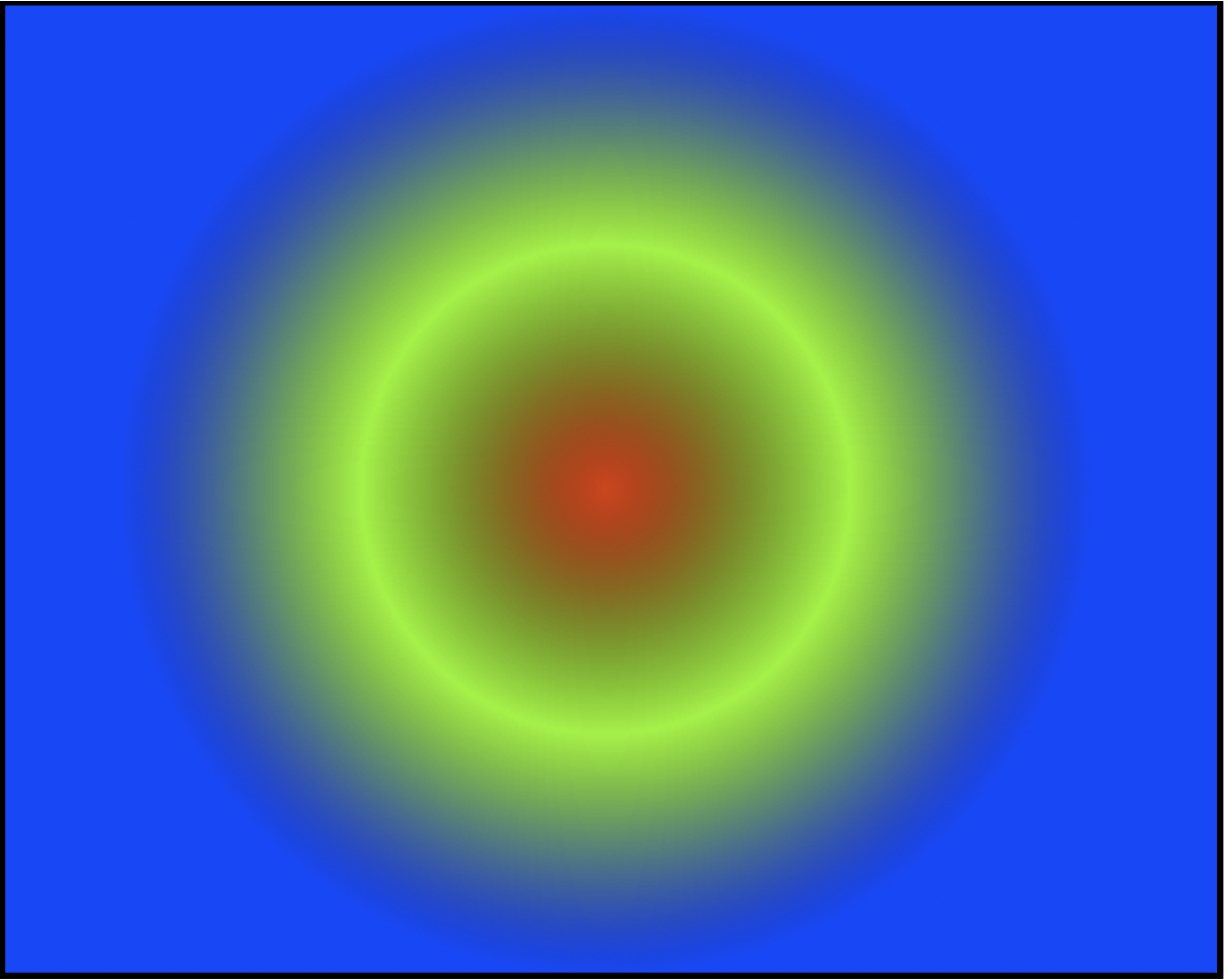
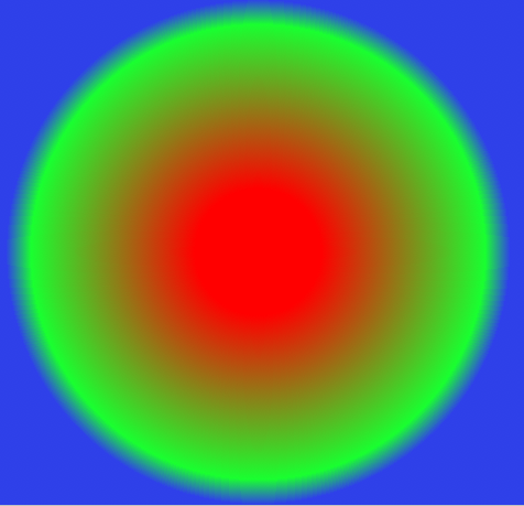
Let’s take a look at an example. Here’s a simple circular gradient. It’s implicitly sized to touch the closest size to its center, and has three color stops, red, green and blue
background-image: radial-gradient(center center, circle closest-side, #ff0000, #00ff00, #0000ff )
Notice how each stop is separated by a comma.
And here’s what it this will look like in a browser which supports radial gradients.
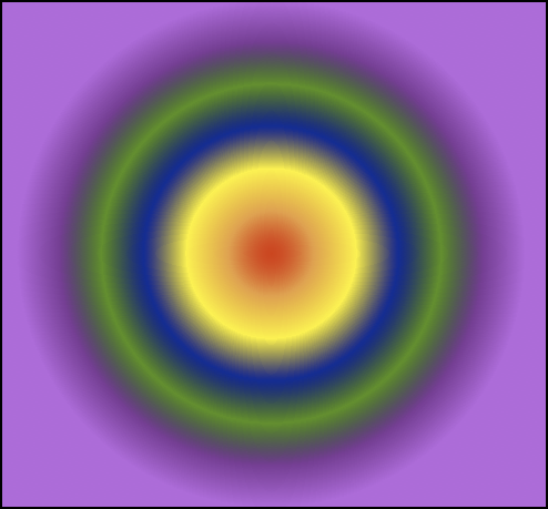
If we add more stops, these are simply evenly spaced in the same size, as here, where we have 6 color stops, evenly spaced across the size of the gradient.
background-image: radial-gradient(center center, circle closest-side, #ff0000 ,#ff9f40 ,#fff81f ,#050a99 ,#0b990f ,#911c99 ,#d24fe0 )
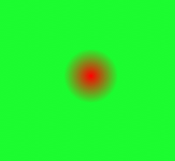
Color stops can, as we mentioned, optionally also specify a length or percentage value. So, we can make color stops a specific distance apart from one another, like so:
background-image: radial-gradient(center center, circle closest-side, #ff0000 25%, #19ff30 90%, #2f3ced 100%)
Notice again, the color and position of each stop is separated by a space, and again each stop is separated by a comma.
It’s also possible to use length values, like px and em in place of percentages, and to mix all three forms of color stop (color alone, percentage and lengths). Keep in mind that percentage gradients will adapt to the size of the element, so that when it grows or shrinks in size the gradient remains in proportion to the element’s size, and so in many cases, percentage gradient stops (or simple color stops specified only by color) are likely to be the most adaptable choice.
Coloring inside and outside the gradient
You might have noticed that in our examples, outside the gradient shape is a solid color background, the color being that of the last color stop specified. Once the gradient completes, whatever the finishing color is will then fill the remainder of the element’s background.
In this last example, you might also have noticed the same thing happens inside the gradient shape. Our first color stop is at 25%, so from the center of the gradient to 25% of its width, we have a solid red color. The red only fades smoothly into the next color stop, green, from 25% out from the gradient shape’s center.
Stop positions can in fact be greater than 100% of the size of the gradient, so we can fill the entire element with a gradient by specifying a final stop position large enough that the entire element is covered by the gradient.
Repeating gradients
As with linear gradients, radial gradients can repeat. This we specify with a slightly different value name – repeating-radial-gradient. If we take our previous gradient, and repeat it, here’s what we get
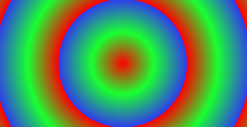
background-image: repeating-radial-gradient(center center, circle closest-side, #ff0000 25%, #19ff30 90%, #2f3ced 100%)
Where we would have solid color outside the gradient shape, we now have the gradient repeating. If we reduce the size of the gradient, the effect becomes more pronounced. In this example, we reduce the size of the gradient shape, to get the following non-repeating gradient.
background-image: radial-gradient(center center, circle closest-side, #ff0000 0%,#19ff30 29%)
Now if we repeat the gradient, the effect is far more noticeable.
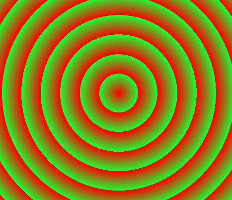
background-image: repeating-radial-gradient(center center, circle closest-side, #ff0000 0%,#19ff30 29%)
Doing the heavy lifting for you
Shapes, sizes, centers, radii, stops… If it all sounds like a lot to learn and remember, then again we’re here to help. As we’ve done for linear gradients, we’ve built a radial gradient tool, which helps you build gradients, without having to remember all the heavy lifting.
As with our linear gradient tool, in addition to just helping you create radial gradient, it has some other features.
- You can tweet a link to a gradient you’ve created by simply clicking a button
- You can copy the url of your gradient, and send it to someone via email, put it in a link (like I’ve done for many of these examples) or otherwise share it
- Via the magic of HTML5 localStorage, it remembers your most recent gradient, and other settings next time you visit
- It adds vendor prefixes for all modern browsers (as an option)
- It adds the start color as a background color for older browsers
- There’s a related tool for creating old-style Webkit gradients
- It provides up to the minute browser compatibility information (provided I remember to update that as browsers change)
- It looks really pretty, all thanks to CSS gradients of course
So give it a try, and let us know what you think.
Browser Compatibility
Despite being relatively new, and as yet not completely specified, radial gradients are safe to use in a way that is backwards compatible, and are in fact quite widely supported (we’ll take a look at which browsers support them in a moment).
To ensure compatibility and accessibility when using radial gradients, as with linear gradients, it’s important to
- include vendor specific prefixes (-o-, -ms-, -moz, -webkit-), as well as the standard form of gradient values
- include a background color for browsers which don’t support gradients. Make sure the text of an element with a gradient background has sufficient contrast with the element’s background color
Browser support
A quick summary of current browser support for CSS Radial Gradients (based on the information at the fantastic When Can I Use).
- Safari 4 introduced radial gradients, though as noted with a different syntax from that detailed here. The vendor prefix -webkit- is required for gradients in Safari 4.1 and newer.
- Safari 5.1 introduces the syntax detailed here, as well as continuing to support the older style syntax. Again, the -webkit- vendor prefix is required.
- Firefox 3.6 was the first browser to support the current gradient syntax. The -moz- prefix is required, and it’s currently only supported on backgrounds.
- Chrome 10 and up (and probably earlier versions) supported the syntax for gradients detailed here. The -webkit- prefix is required.
- Opera 11.1 introduced linear gradient support, but at present does not support radial gradients of any kind
- Internet Explorer 10 also features CSS radial gradients, using the prefix -ms-, and also only on backgrounds.
Gradients can be computationally intensive, and may cause browsers running on older hardware difficulty. At present they are not able to be animated with CSS transitions in any browser which supports transitions.
Links, galleries, articles and more
Here are some places to go to learn more.
- Lea Verou has some great presentations on Gradients, including one at our recent @media conference, which you can watch the slides of and listen to
- Lea has also put together a CSS pattern gallery, showcasing some amazing designs using CSS gradients
- Estelle Weyl also has a great gallery of gradient patterns
- Detailed support information for CSS gradients, and many other modern HTML5, CSS3 and DOM features is available at When Can I Use?
The wrap
I hope this article has been helpful in understanding a little more deeply what is really going on with radial gradients, and hope the radial gradient tool makes working with them enjoyable. Let me know if you’ve found them helpful on twitter!
Great reading, every weekend.
We round up the best writing about the web and send it your way each Friday.